PRODUCT DESIGN | WINTER 2021
BOARDX SLIDES TOOL
Break down complex information into digestible sections that make it easy for the audience to follow along and refer back to the content.
MY ROLE
Product Strategy
User Research
User Experience
Usability Testing
TEAM MEMBERS
Usam Shen (Founder)
Shiqi Mei (PM)
Dennis Zhuang (Developer)
Chengyu Zhao (Designer)
TIMELINE
8 weeks
METHODS
User Interviews
Competitive Analysis
BoardX is an online workspace in the form of a digital whiteboard that empowers hybrid collaboration by connecting people and teams to brainstorm new ideas and make decisions using sticky notes, texts, connectors, etc.
Background
Before we start, let’s take a look at how online collaboration works on BoardX. Here is a typical flow:
Project owner prepares a whiteboard for collaboration (ie. create a board, invite users, add templates, etc.)
Users collaborate on a whiteboard (ie. add sticky notes, voting, etc.)
Project owner concludes ideas/decisions made during the collaboration & share with the team.
How boardx works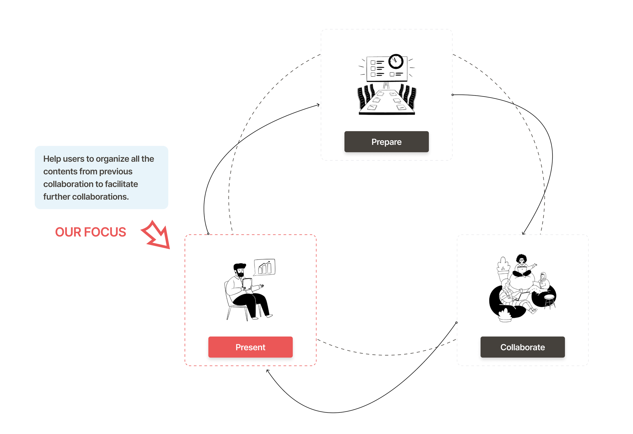
problem
Users need a way to organize and present the contents.
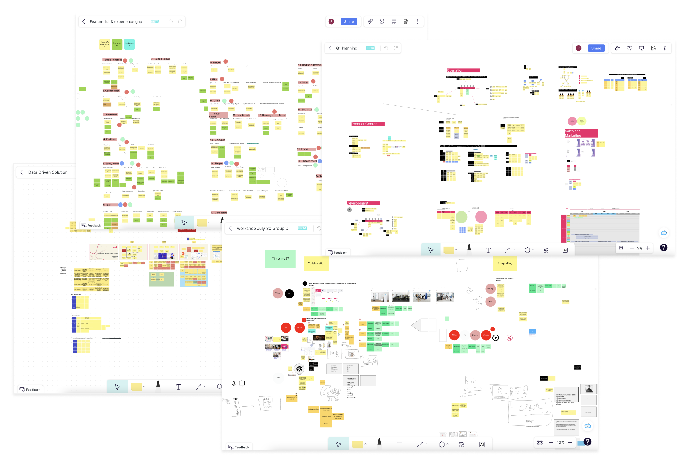
As we observed from our internal collaborations using BoardX, the current whiteboard often results in a situation where the contents on the online whiteboard become a data dump without proper organization or structure.
When async collaborators open a board, they often get lost and don’t know where they should start.
solution
A slides tool that outlines the contents in an organized structure.
With a mission to provide end-to-end support throughout the collaboration journey, our team created a way to break down complex information (whole board) into digestible sections (slides) that make it easy for the users to follow along and refer back to the content.
understand
What is the actual problem?
Let’s first take a look at a common scenario that we notice from our internal users - instead of going over a whiteboard to catch up on progress, users rather ask the project owner for clarifications or explanations, which result in extra calls & meetings.
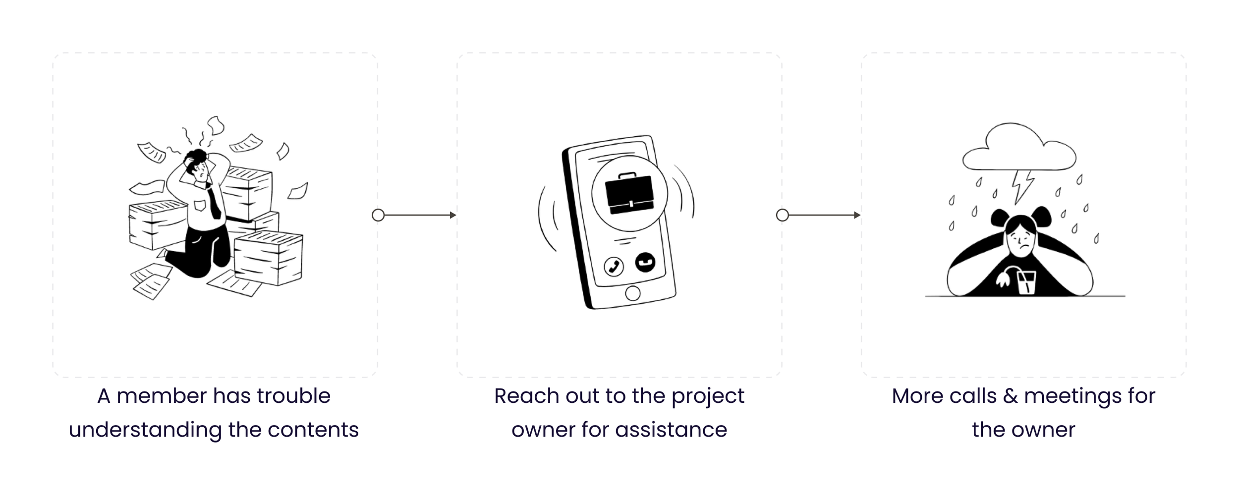
What are the causes?
Based on collected user feedbacks from BoardX internal users, we found the following causes that stopped users from understanding the contents on a board:
Hard to find - There are overwhelmingly massive amount of information.
Lack of organization - The contents are too scattered, without a clear and cohesive organizational structure.
ChallengeHow might we enhance the organization of the whiteboard to ensure content is easily discoverable and accessible?
observe
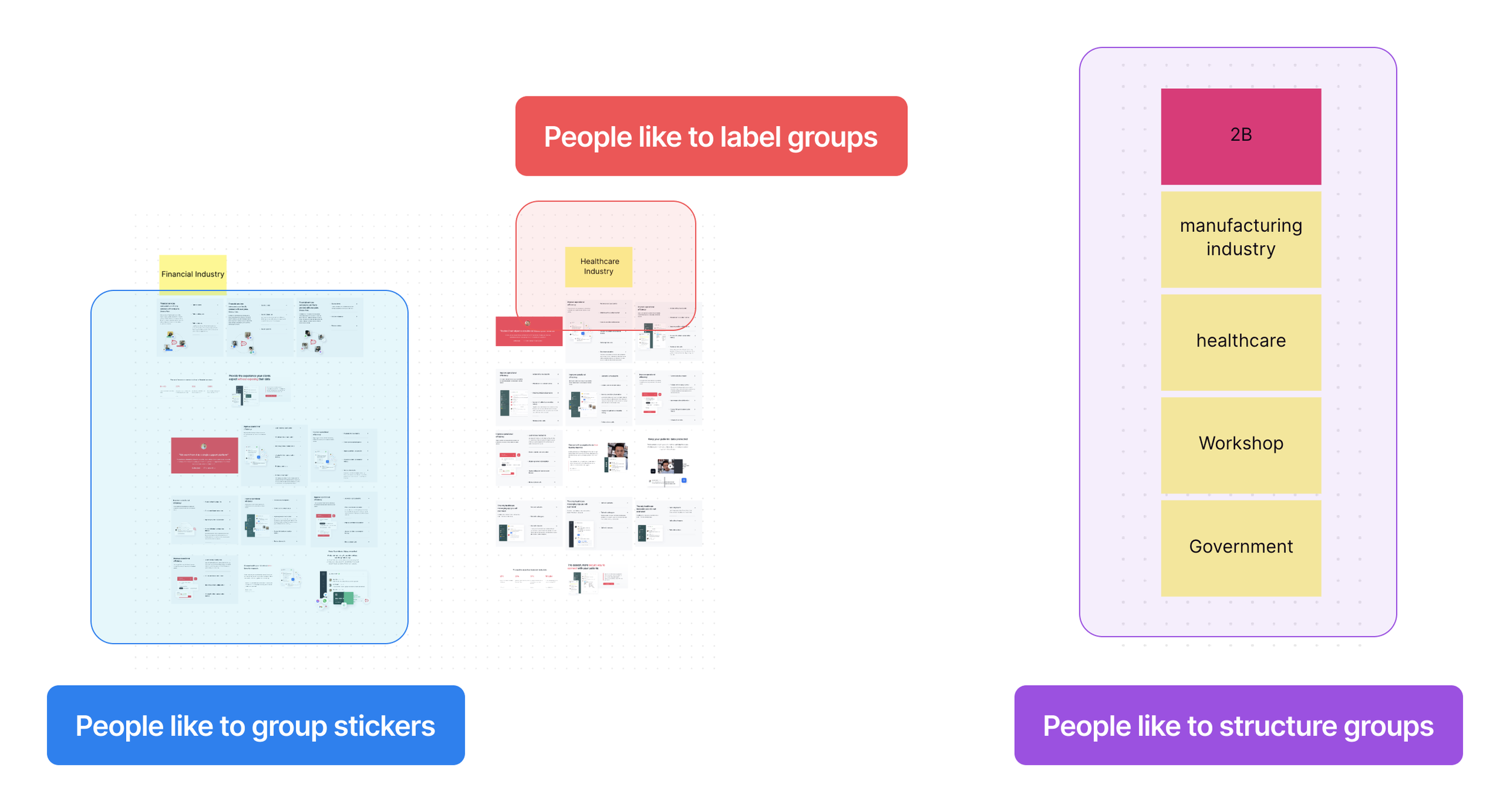
We noticed a common pattern across all whiteboards.
During my 1:1 interviews with our internal users, they all shared their own method organizing the contents. As we gathered and compared screenshots of their overloaded whiteboards, we surprisingly found a very common approach used by most, if not all, users. This can be seen as user’s own way of organizing the contents to promptly identify specific sections.
Users group sticky notes of same category into a section.
Users label groups to remind themselves what they are.
Users group labels to form an overview of the covered topics.
inspiration
Users are already adapted to this method to help them organize & present to other.
If this is how most users do to keep contents organized, then what we need to do is to productize this manual approach into a simple and effective tool or feature.
hypothesisBy providing project owner a tool to outline the contents, the users will find it easy to follow along the whiteboard contents
Goal
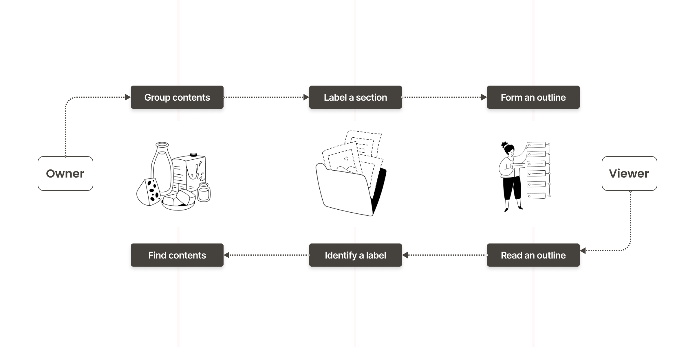
What I need to figure out is simply how to label, highlight, and connect all sections.
The demo below shows what the users should end up seeing - a whiteboard with sections correctly identified & labeled. The users should be able to:
Define a section on a whiteboard.
Add name/description to identify a section.
Arrange all the sections in a logical order.
Explore & decide
Find the most feasible approach.
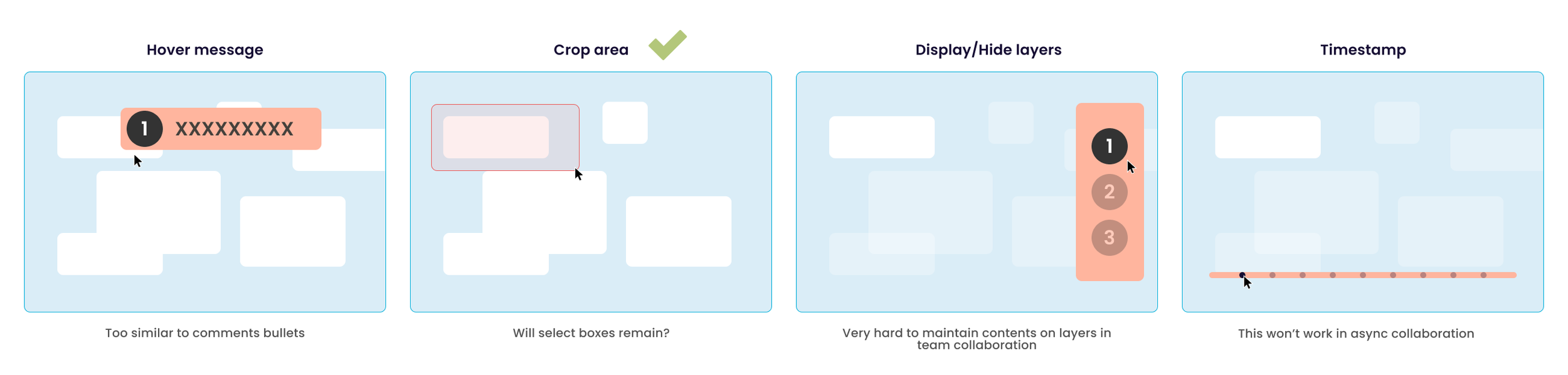
I quickly brainstormed different options and reviewed with the team. The goal was to decide what would be the best approach to the problem.
We made our decision by eliminating concepts that require a huge lift on the technical end and those that are complicated to learn. Last but not least, the concept must clearly address the problem and provides a feasible solution.
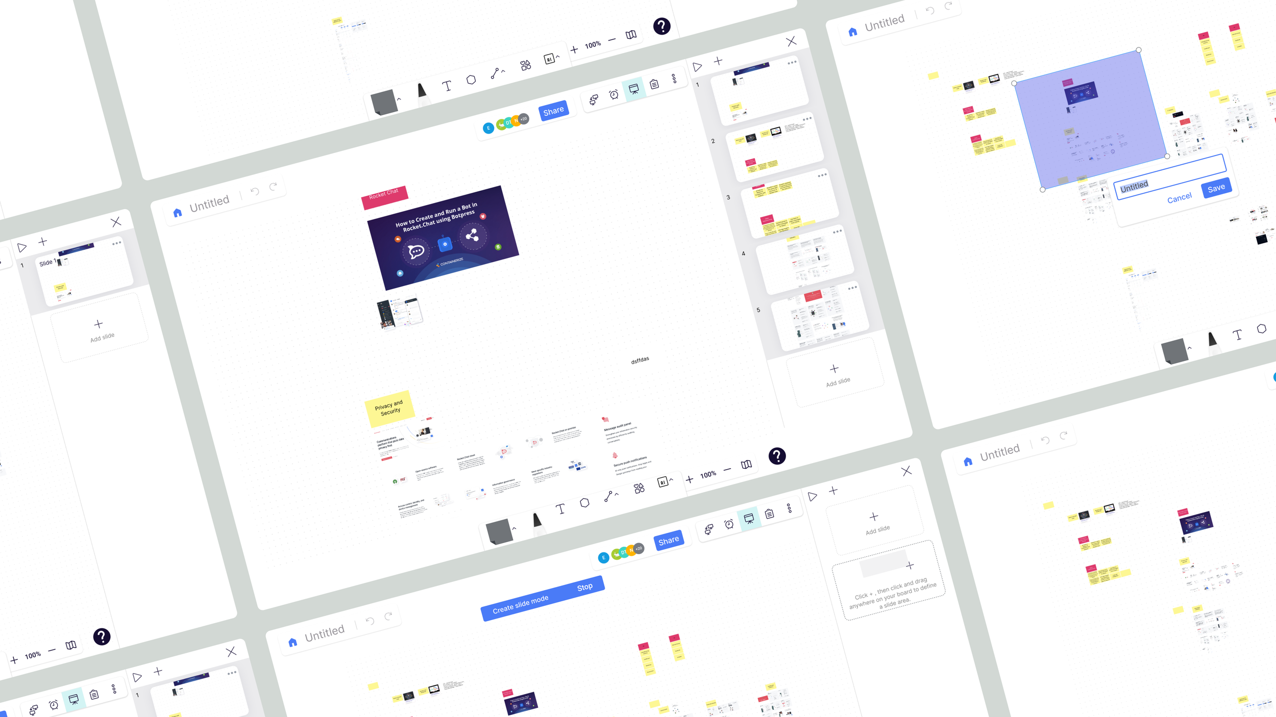
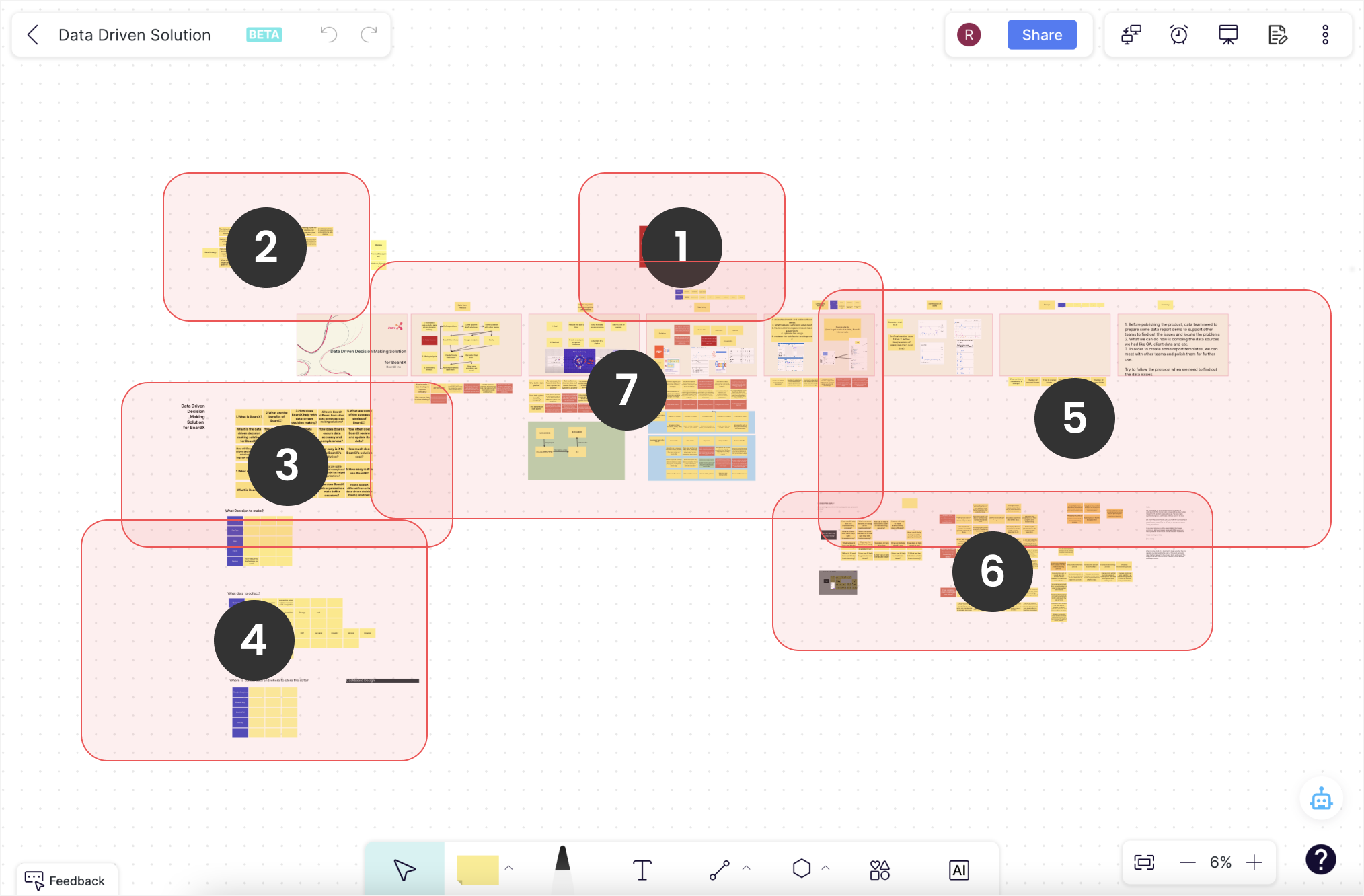
Image below illustrated some of the concepts that I brainstormed. We ended up aligning on moving forward with a “drag & crop” approach, which empowers users to drag an area and form a “slide”.
define slides
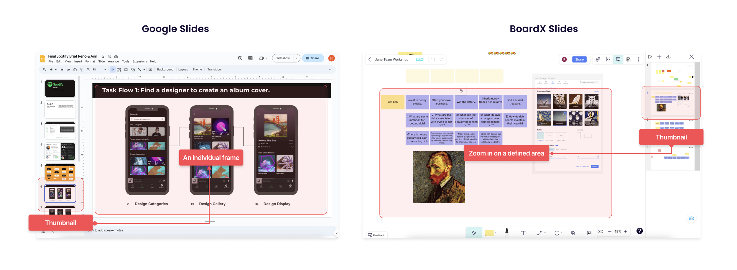
a slide is defined as a shortcut thumbnail to zoom in on a selected area.
We name a cropped area as a slide because the form is similar to a slide that you find in PowerPoint or Google Slides. Same as a traditional slide, they appear as a white frame that groups information together. However, unlike a traditional slide, a BoardX slide isn’t creating an actual frame. It’s a clickable screenshot thumbnail that zooms in on a selected area when a user clicks on it.
why slides
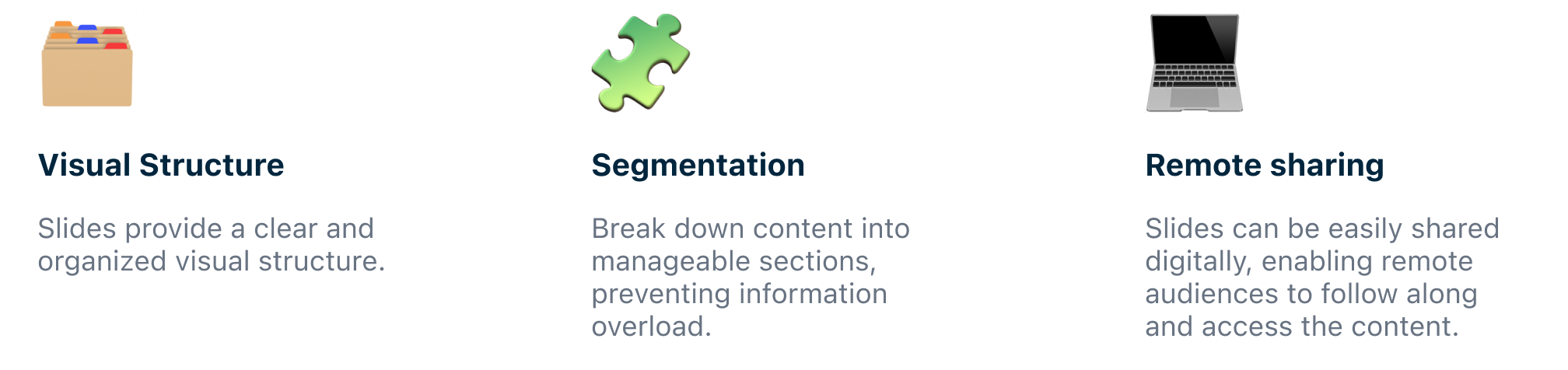
Slides guide the audience through a sequential narrative, facilitating storytelling and ensuring a coherent presentation.
Using slides helps presenters effectively organize ideas, convey information visually, and easily engage the audience. The benefits include 👇
User flow
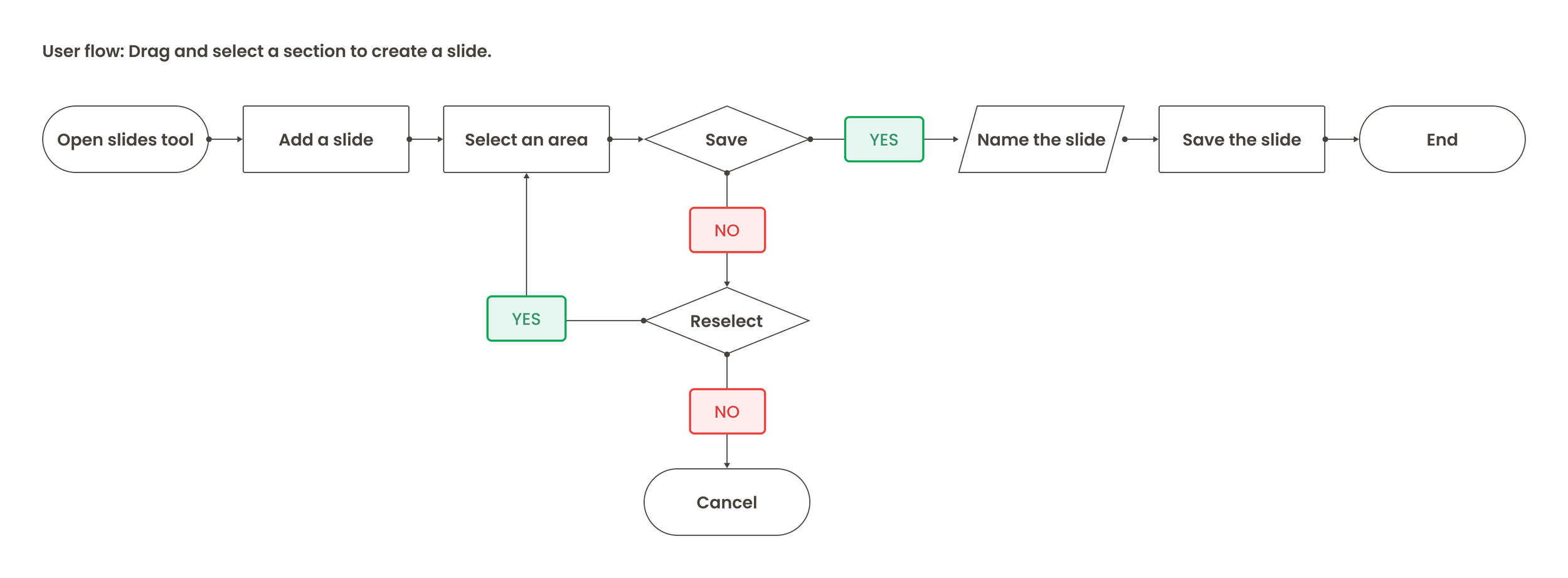
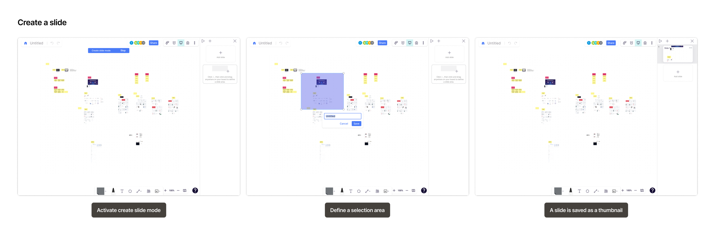
Creating a slide is as easy as dragging and selecting an area, then saving.
The next step is to visually outlines the path that a user takes to achieve the goal. I collaborated with the PM to imagine & define the steps it took to create a slide. Our goal was to minimize unnecessary steps. The perfect experience should get the job done in its simplest form. As a result, the flow involved a few steps:
Add slide > Select an area > Add description > Confirm
initial design
Roll out an initial prototype to collect feedback from users & stakeholders.
I started with creating a simple prototype following the identified user flow. The goal here is to get initial feedback and suggestions that could be incorporated into the next iterations to better align with user expectations.
Feedback & fixes
Users struggle with creating their first slide
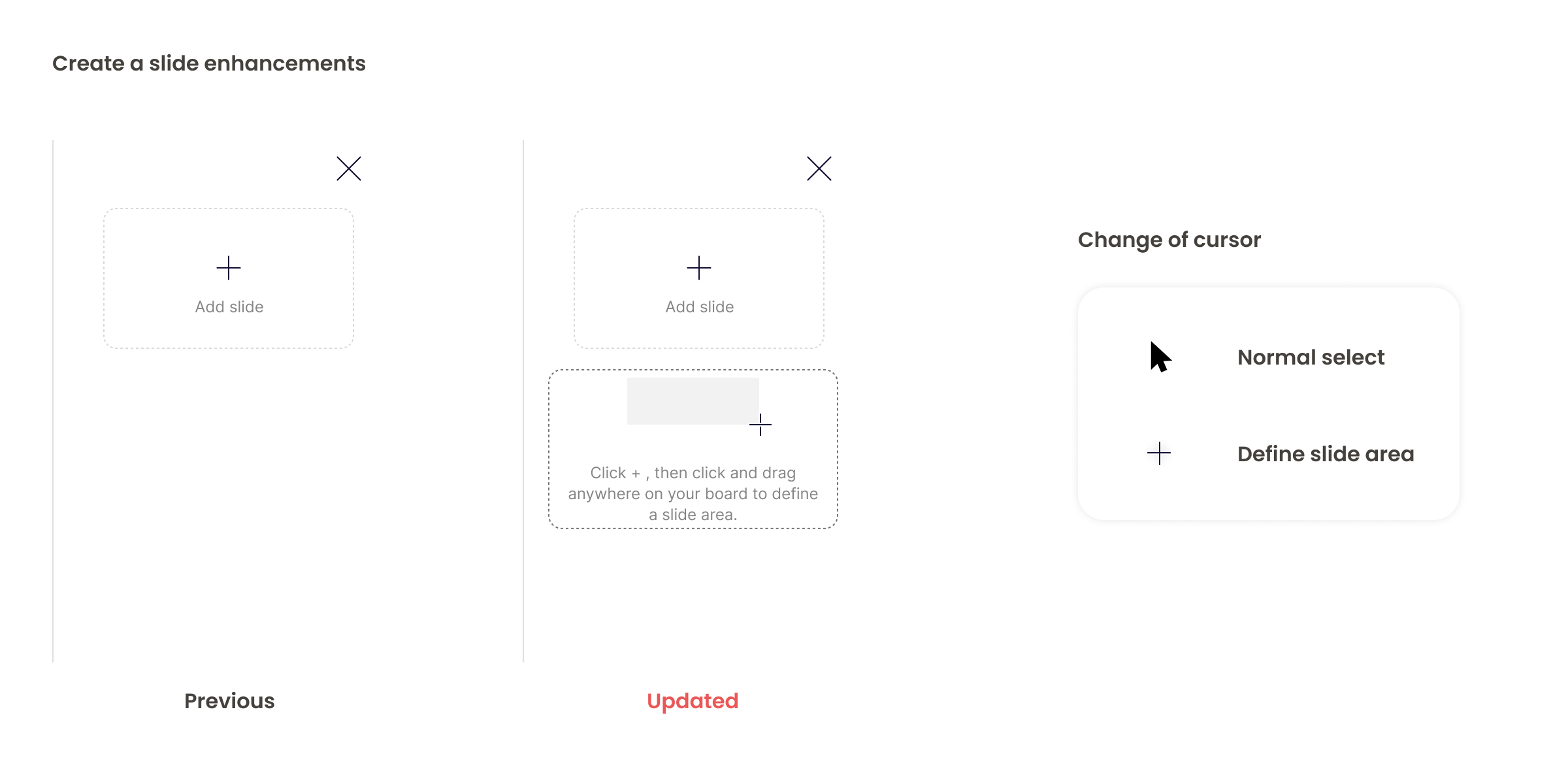
Overall, we received a very positive feedback from our initial testings. Users all love the concept and found the slides tool easy to use and helpful to organize the contents. However, Nearly all of the participants required guidance to create their very first slide.
As we followed up on this during the testing sessions, users reported that they struggle with creating the first slide because users didn’t expect to drag and select an area on the board.
To address this issue, I added a placeholder slide that explains how to create a slide. Also, I collaborated with the developer to implement a cursor change when creating a slide.
Iterations
more iterations
The creating slides experience didn’t feel buttery smooth…
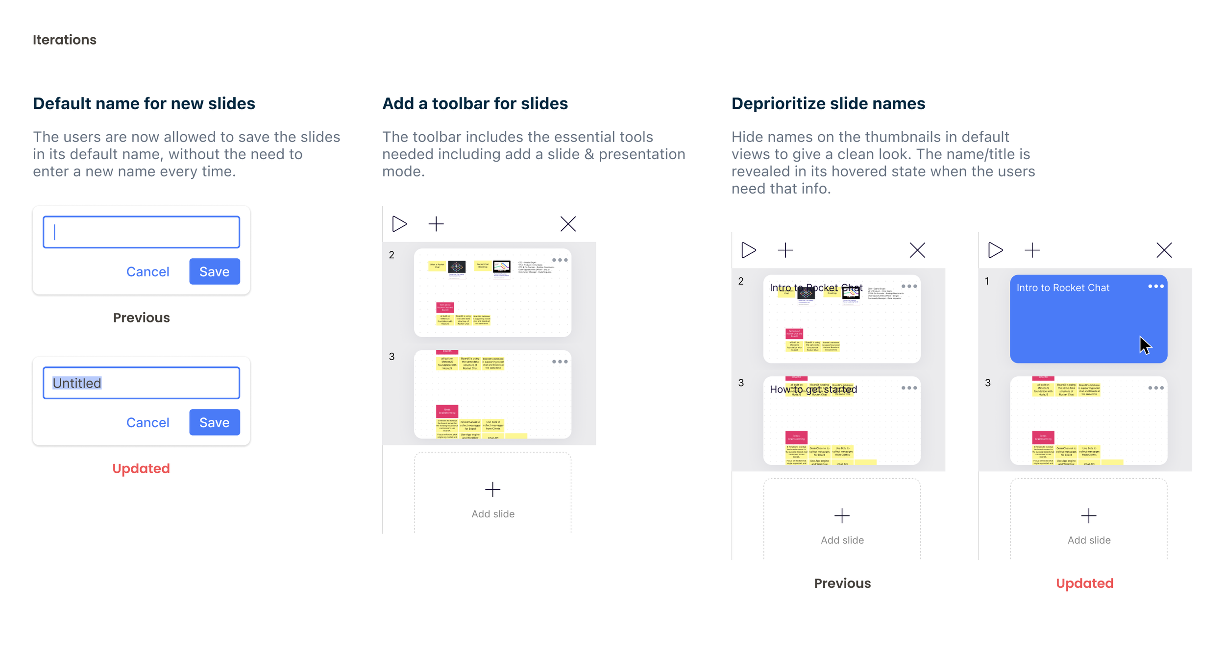
As we moved to the beta environment, we noticed a few issues from actual usage:
Label a slide - Labeling a slide wasn’t as useful & mandatory as we thought it would be. Indeed, naming a slide every time a slide is created severely slows down users’ work productivity.
Add a slide button - The button often got pushed out of fold by slides thumbnails.
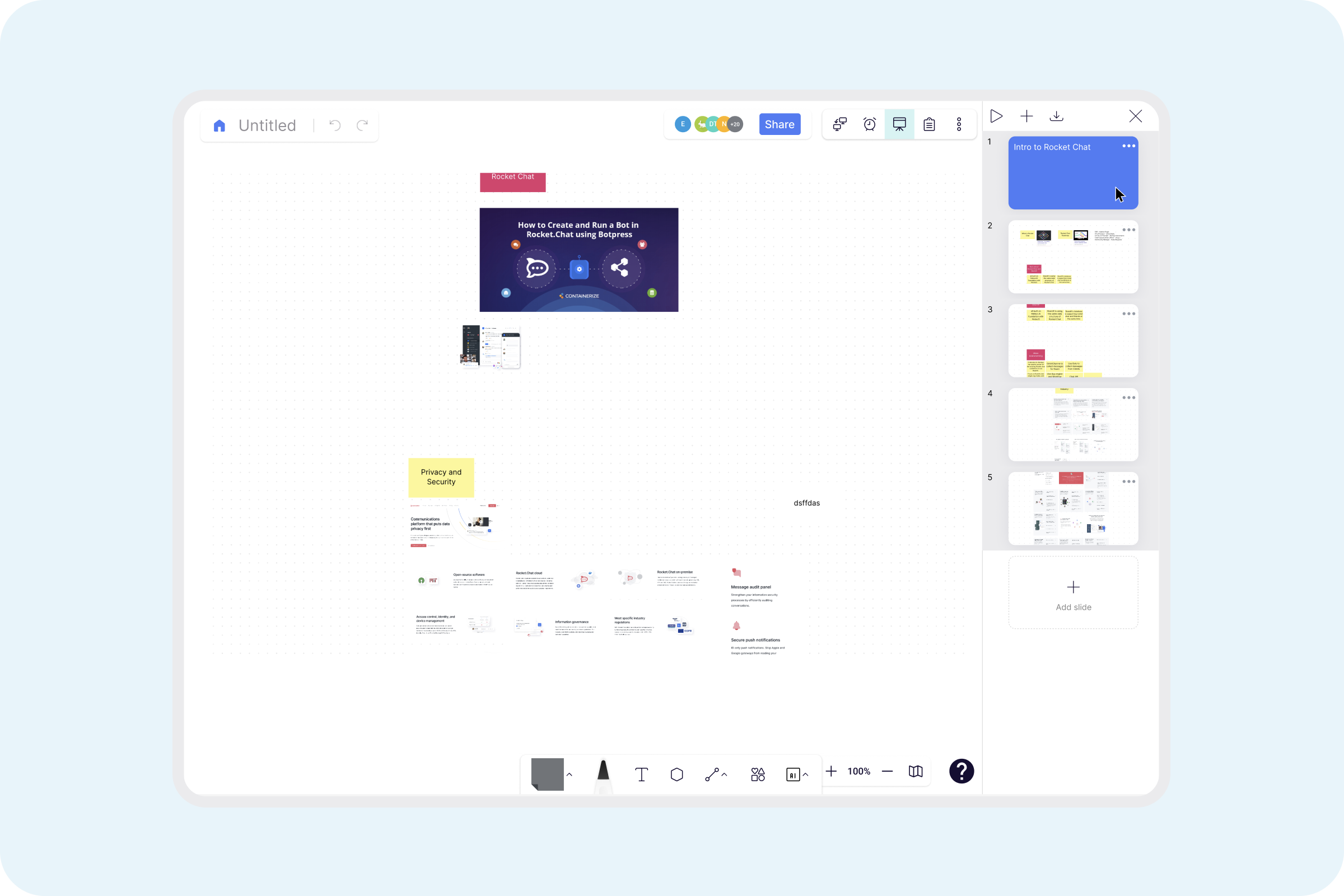
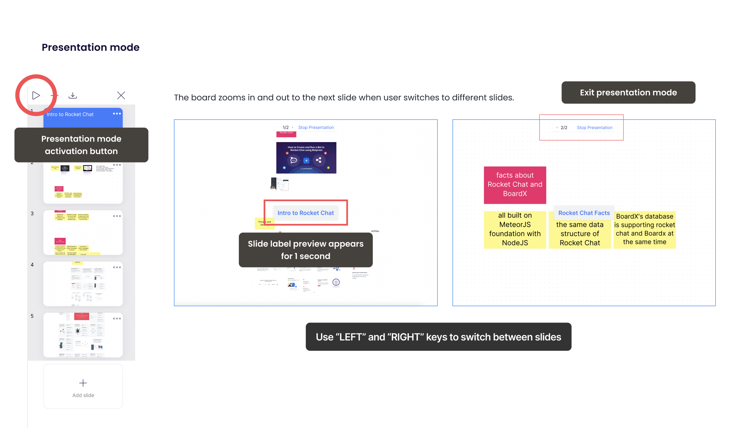
Viewing experience - Users expected to view the slides in a presentation mode.
To ensure a pleasant user experience and maximize productivity, I worked closely with the team to make the following changes to address these issue:
ResultUpon implementing the changes, we received an increase in satisfaction rate among our internal tester. All testers (11 participants) found the feature helpful in organizing contents on a board.
Final design
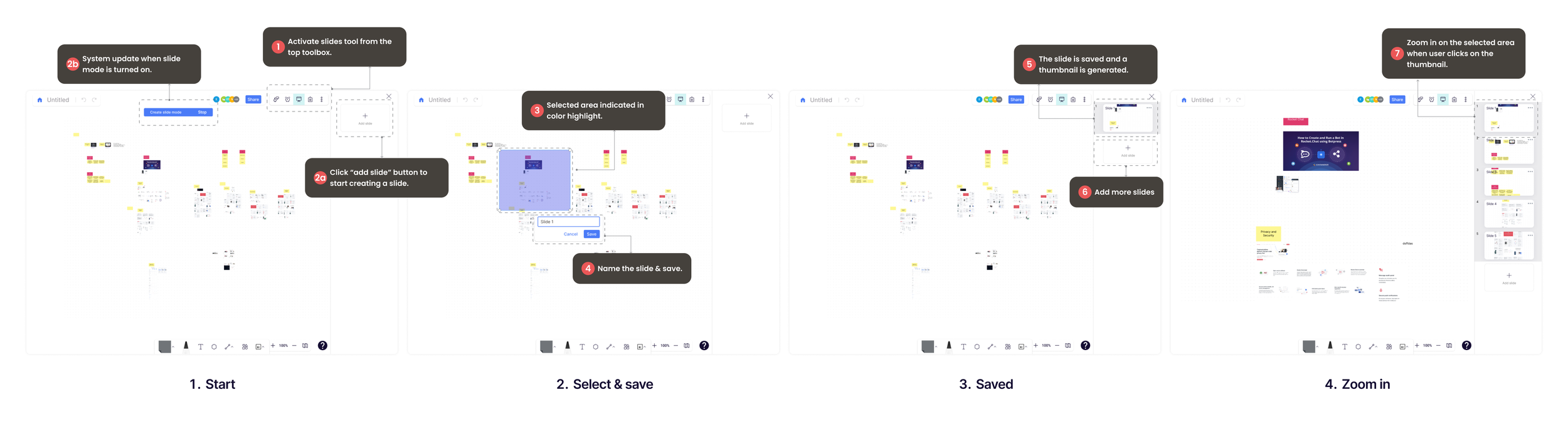
use case 1Identify a section and Create a slide.
Since slides tool is not always needed, the slides side bar is only visible when slides icon is selected.
To keep users informed with their actions, a system status indicator will appear when create slide mode is activated.
To further assist users learning the tool, cursor changes accordingly to guide users dragging an area.
Options to either save or cancel the selection.
To avoid any mis-clicks, it automatically exit create slide mode after user “save” or “cancel” a selection.
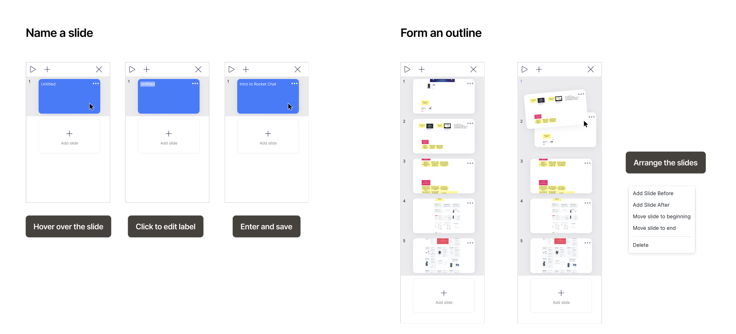
use case 2Label the slides and arrange them in order.
Allow users to hover on a slide to find its title when needed.
Apply a solid-blue overlay for the thumbnail to enhance readability of the title when it’s hovered.
The slides follow a same mechanism as other slides tools to arrange the order.
feature demo
feature demo 1Create a slide
demo 2Preview and arrange slides
Measure success
We observed a positive collaboration impact among our beta users.
To evaluate the design's effectiveness in facilitating content comprehension on a cluttered whiteboard, we examine its impact on enhancing content sharing for owners and improving content consumption for viewers. Our analysis indicates that boards incorporating the slides feature are twice as likely to be shared and yield an average of 1.8 view sessions per user (55% increase).
Final thoughts
A Winning Combination of Simplicity and Functionality for Seamless Collaboration
Although BoardX’s whiteboard collaboration tool is still in open beta as of Q2 2023, the slides feature has remained the #1 feature in overall satisfaction rate among our beta testers. Through this project, I've discovered the magic of blending functionality with simplicity, emphasizing the user's perspective at every step. I've gained a deep appreciation for iterative improvement and the far-reaching influence of design in fostering seamless collaboration.