PRODUCT DESIGN | SPRING 2023
Frich Expense Tracking
Create a simple way for college students to oversee their monthly spendings & potential savings.
MY ROLE
Product Strategy
User Research
User Experience
Usability Testing
TEAM MEMBERS
Aleksandra Medina (Lead)
Michael Machuca (PM)
Chengyu Zhao (Design)
TIMELINE
1 month
METHODS
User Interviews
Competitive Analysis
Frich’s Expense Tracking is a tool that allows college students to easily manage all of their transactions in one place. It helps them to track all of their expenses and oversee potential savings.
Background
The problem
Previous expense tracking experience didn’t help users to save.
Starting in 2023, we observed an incremental decrease in user engagement rate of Expense Tracking page. Based on usage insights & user feedback, we found the following issues from the previous experience:
-
Outdated design & layout, unsuitable for the current stage of the product.
-
The information architecture was not tailored to the user behaviors, causing excessive interactions to complete a task.
-
Insufficient emphasis on the product's value proposition. Inability to enhance users’ awareness of their spending allowance.

The previous experience focused money spent, but users cared about money allowance remained.
solution
Create a simple way to track both money spent and money saved.
As a result, we reimagined the expenses tracking experience by replacing the legacy design components and providing the functionalities required to help college students track their expenses and savings.

Research
College students are constantly suffering from overspending…
To kickstart the design process, we first spoke with several college students to learn about their experience with the managing their monthly expenses.
We found most college students used their finance app in the following use cases:
✅ Review transactions
✅ Identify spending trend
❌ Tracking remaining income (missing on Frich)

Our findings suggested that besides fulfilling the basic needs of tracking transactions (which is knowing where their money go), they also need a way to know how much money they have left.
Frich didn’t have a way to fulfill the last common need of college students.
our users
things you should know about gen z…
Our primary users are students from Gen Z. Based on our past experience design for Gen Z, we've recognized that some traditional methods or frameworks may not be applicable to this generation. Therefore, in our design process, we need to delve further into understanding the spending habits and thought processes of Generation Z in order to better align with their usage patterns.

Challengesat this stage, The challenges were (1) defining how students perceive savings and (2) finding the most practical budgeting approach for gen z.
Competitors
Key takeaways
We looked at how competitors approached similar challenges.
To better understand how existing products helped their users with their needs, I scoped out how our competitors approached expense management & budgeting.


What I learned from our competitors was that:
Savings is defined as leftover income
They apply a lot of adult stuffs that don’t apply to most students, such as mortgage.
hypothesisby providing users a simple way to track monthly leftover, users will engage with the feature more often.
Opportunities
The puzzle pieces that form the envisioned expense tracking experience.
Based on research findings and hypothesis, I identify the core information that must be included within expense tracking experience:

principles
DEfine and follow the 3 design pillars.
The solution was crafted with the following Frich design principles in mind.

ideation
Take insights into visual exploration & execution.
Starting with exploring different approaches in simple lines & boxes to visualize potential concepts. During this phase, the goal was to picture the full functionalities and their placements on the user interface. I first divided the user experience into 3 sections:
Activation:
Guide users through initial setup and usage, helping them understand the product's features and benefits
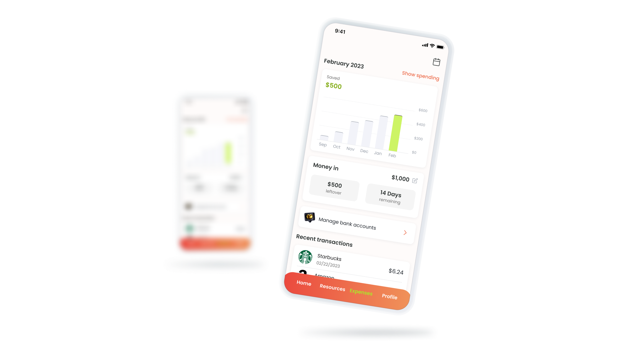
Dashboard view:
Expense landing page provides a quick dashboard view of their spending total, project saving, recent transactions, and category breakdown.
Control options:
Empower users to further review or make adjustment to the dashboard items.

Explore
Team’s concerns
Create wireframes to walkthrough the concepts with the team.
During this phase, the goal was to quickly create wireframes to better explain & validate the concepts with low investment in time. I prepared two possible options annotated with the design decisions for the initial design review.
Option 1: Add a savings projection widget using the simple magical equation (income - expenses).
Option 2: Set up spending limits for different categories.

Upon reviewing the different design options, the whole team agreed on moving forward with Option 1 for the following reasons:
The company didn’t have the plan to provide comprehensive budgeting solutions, thus we didn’t take scalability into account for this project.
Our goal was to help users monitor & foresee their potential savings in a simple way.
Option 1 was more closely aligned with Gen Z’s spending habit & financial need.
We had several questions remaining for the proposed solution…
We were still not sure if the new changes will actually meet our expectations in the following metrics:

Usability testing
The design fell short in progress projection and clear presentation.
We rolled out an initial testing with our beta testers recruited from NYC colleges. During these sessions, we asked the users to interact with the app under given prompts & leave feedback.
Overall, we received a positive feedback on the overall experience. Users find it easy to access their transactions in one place. However, we noticed users had a hard time understanding the charts and the savings widget. Also, testers reported it lacked a way to project their saving progress.

Iterations

The new dashboard used bar graphs to indicate historical progress in both spending & saving. We also added units on the Y-axis to avoid confusion.

We made a swap between leftover & money in. Now users will perceive it as “have $XXX for X days”.
ResultI followed up with the same testers and walkthrough the changes. They were all happy with the changes and were likely to use the feature for themselves!
Final design
Usecase 1review transactions to prevent unauthorized payments.
A card on the landing page displaying most recent transactions (max. 4) for quick reviewing.
Option to view all transactions at all transactions page.
Quick filters to help users easily oversee transactions in each Frich category.
To keep a clean interface, each transaction list only display name of vendor, payment date, and payment amount.
More payment details are placed on a bottom sheet upon tapping the transaction.

Usecase 2identify spending trend to increase self-awareness of overspending categories.
Allow users to add up to 9 bank accounts.
Automatically categorize all transactions from all accounts into 8 Frich categories tailored to Gen Z’s spending pattern.
Show category spendings in total amount ($), number of transactions, and distributed percentage.
Each category list takes users to total expenses page with category filter automatically applied.

Usecase 3Track monthly potential savings to prevent overspending.
A savings calculation widget to help users figure out remaining allowance for the rest of current month.
A progress dashboard to oversee their saving progress over the past few months (up to 6 months).
A switch button to toggle between money spent & money saved dashboard, indicated in primary color.
Different color to differentiate money spent vs. money saved.
Allow students to easily adjust monthly money-in since most of them do not have reliable income.

other piecesThe remaining screens created to fully enhance the experience.
Activation screens - explain the core functions and values to our users.
Get started screen for Plaid authorization - explain how we handle transactions safely and securely.
Action success & failure screens - help users to stay informed with their interactions.
Bank connection failed - badge notification when KYC failed.

Final thoughts
A success in lowering user’s expenses.
We successfully launched the updated feature in App Store in March 2023. By the end of Q2, the feature has a 44% adoption rate and helped users save nearly 12% of their income on average per month. Last but not least, activities on expenses page accounts for nearly half of the user sessions on Frich.
Moving forward, there are many potential opportunities within the current experience that could bring users more values. The next step will be focusing on finding that right opportunity and assessing its impacts on both the users and the business.