PRODUCT DESIGN | B2B SaaS
Paycom ACA Dashboard
An intuitive, user-centric interface that simplifies navigation, clearly outlines user goals, and ensures a seamless experience from start to finish.
MY ROLE
Product Strategy
Data-Driven Design
User Testing & Iteration
Information Hierarchy
UX Research
TEAM MEMBERS
1 Sr. Product Manager
1 Product Champion
1 UX Rsearcher
3 Developers
1 QA
1 Product Designer (Me)
TIMELINE
Feb 2024 - Aug 2024
CATEGORIES
HRM
Gov & Compliance
Background
ACA Dashboard is a critical compliance management tool.
The ACA Dashboard is designed to surface key compliance risks and guide users toward timely corrective actions.
Example Task Flow:
Find widget.
Read data information.
Find the issue and take action.
Problem
Inefficient task completion
Our findings show that users struggle to identify issues and navigate to the appropriate section to resolve them efficiently.
-
Low Task Success Rate
Only 55% of users successfully complete critical tasks (eg. checking ACA Status or Affordability Status)
-
Long Time on Task
Users spend an average of 8 minutes per task, significantly higher than the 5-minute industry benchmark.
-

Low Perceived Ease of Use
Common pain points include dispersed information, non-intuitive widget presentation, and difficulty in locating key data quickly.
Analysis
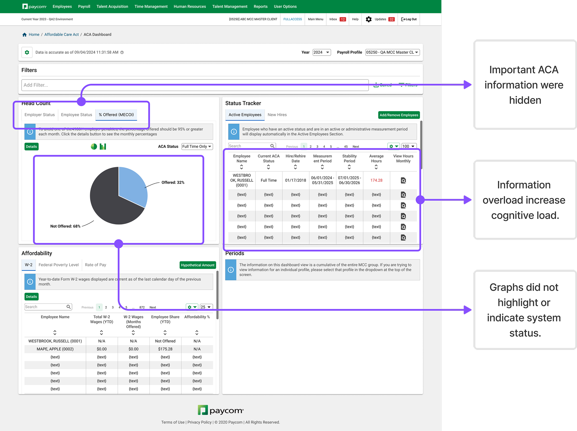
Information overload and lack of clear guidance seemed to be the causes.
Our initial assumption was that the information was disorganized and that the widget presentation failed to directly highlight issues or guide users toward identifying them.
-
Assumption: If we surface hidden information, will it expedite task completion?
-
Assumption: If we separate critical items from other irrelevant items, will users be more likely to stay on task?
-
Assumption: If we upgrade data visualization tailored to their main use case, will that help users quickly identify issues?
Design Objective
Refine the widget design and information hierarchy to enhance usability, enabling users to discover issue and complete key tasks more efficiently.
Initial Design Approach
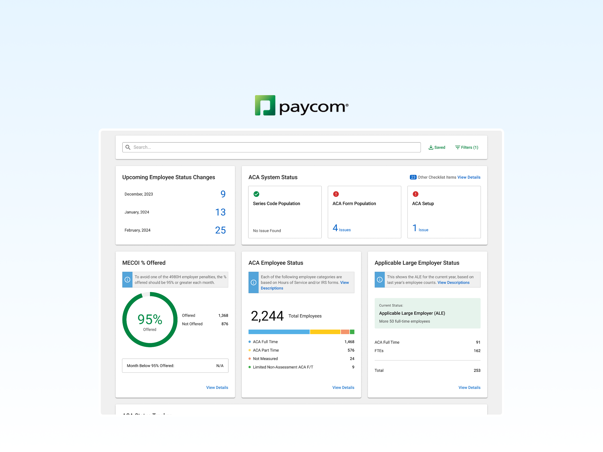
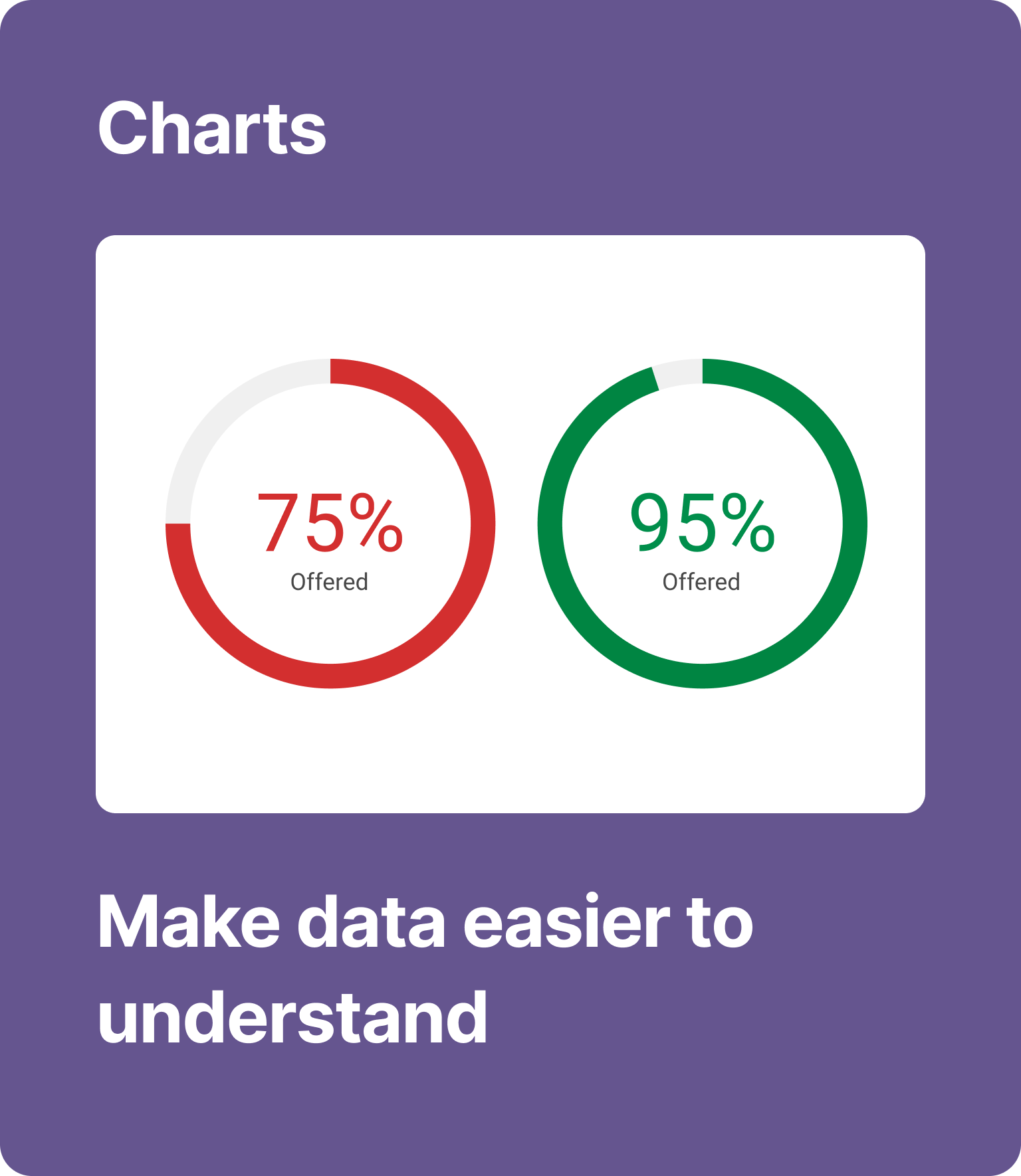
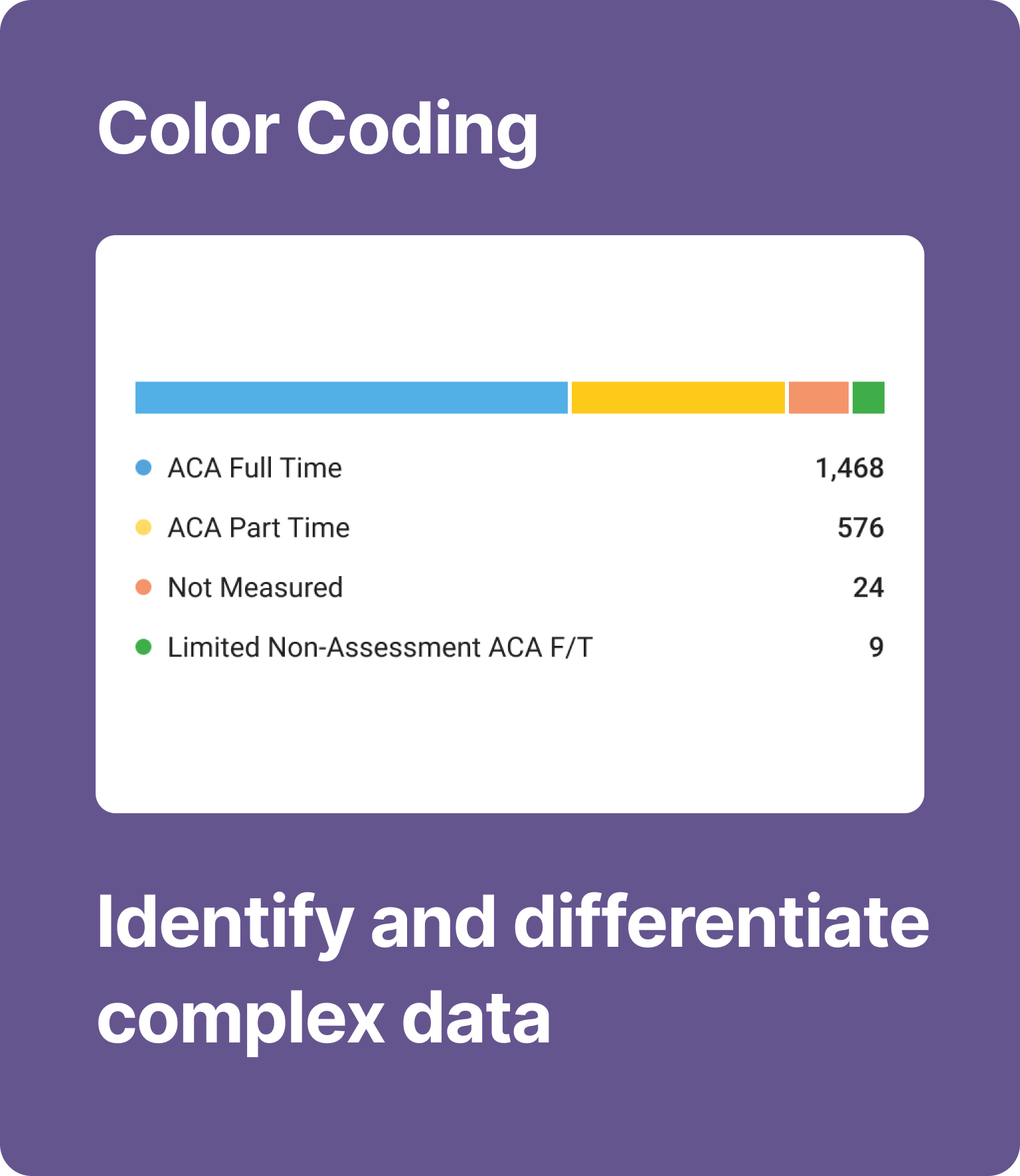
Widget Visual Optimization
Enhanced the visual design of Dashboard widgets by incorporating clearer charts, color coding, and progress indicators to improve information presentation.
Change 1
Make key data more accessible
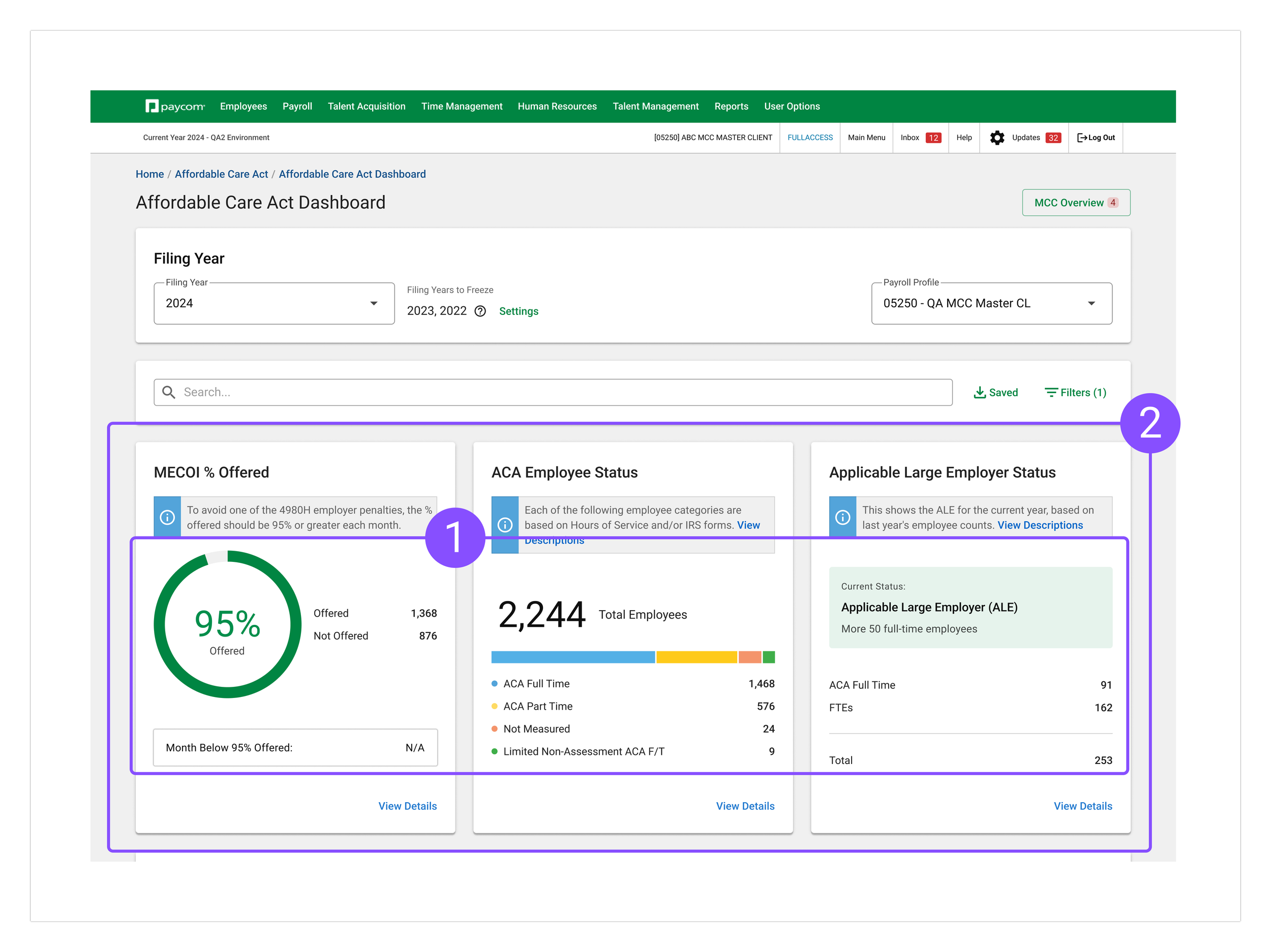
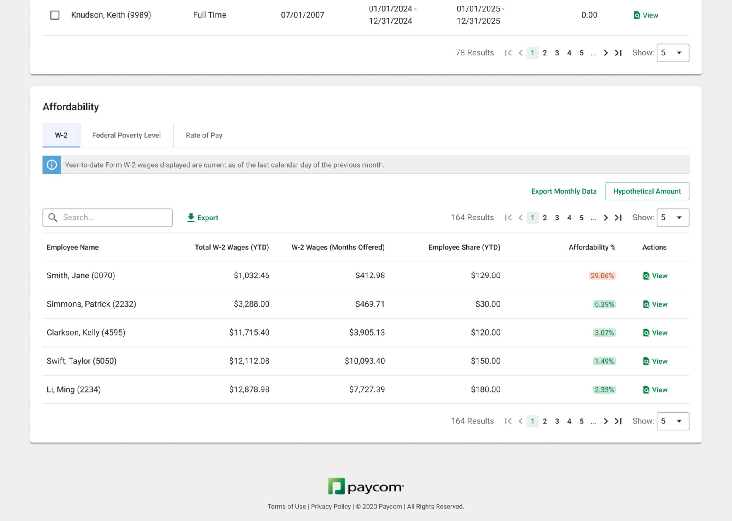
I enhanced the dashboard with intuitive charts to make compliance status clearer and surfaced critical information from hidden tabs to improve discoverability. These upgrades streamline navigation and help users access key insights more efficiently.
Change 2
1. Highlight ACA Compliance Status
Using intuitive charts to convey ACA compliance status at a glance.
Enhanced compliance monitoring by separating key information items from large data pool.
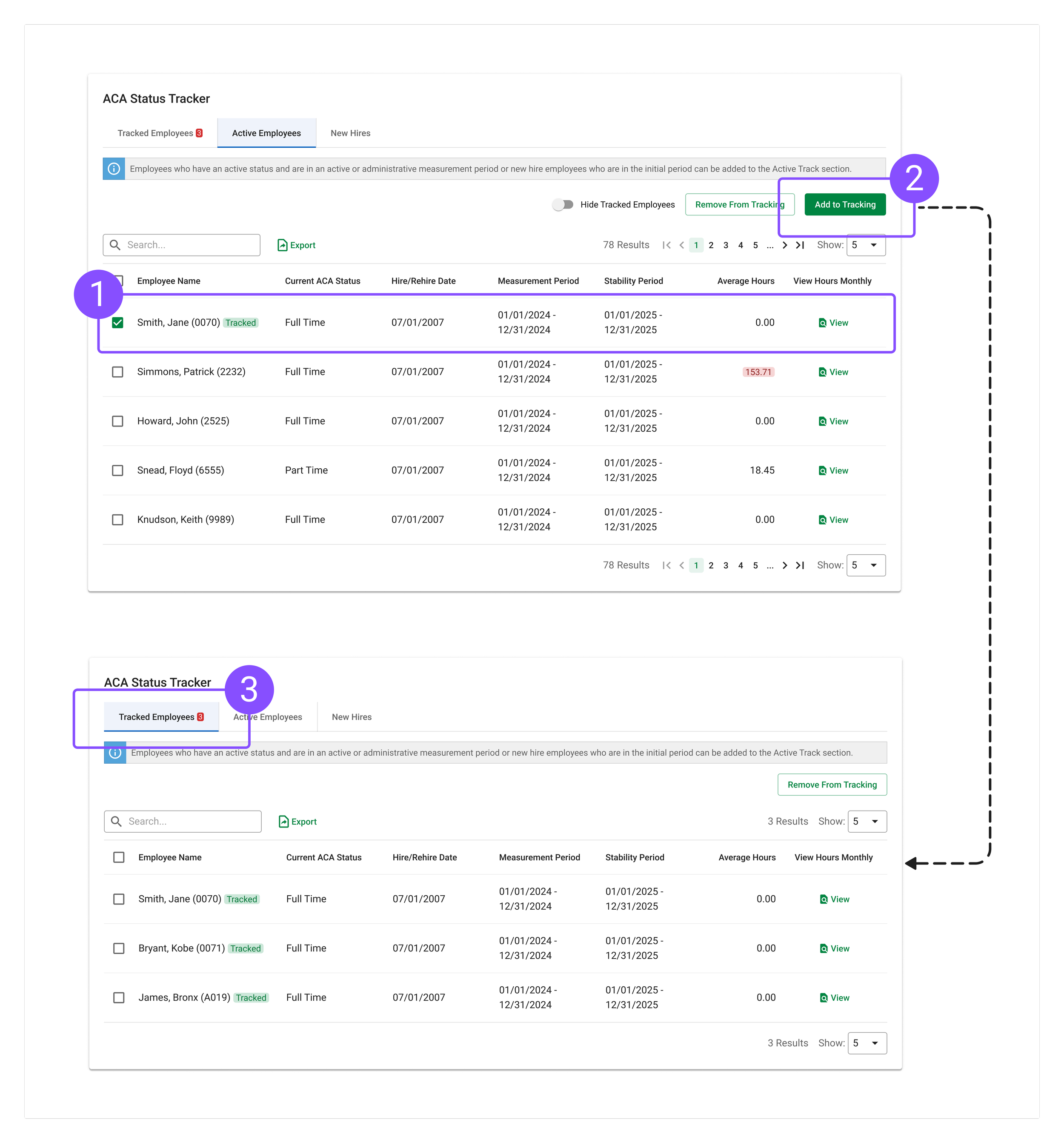
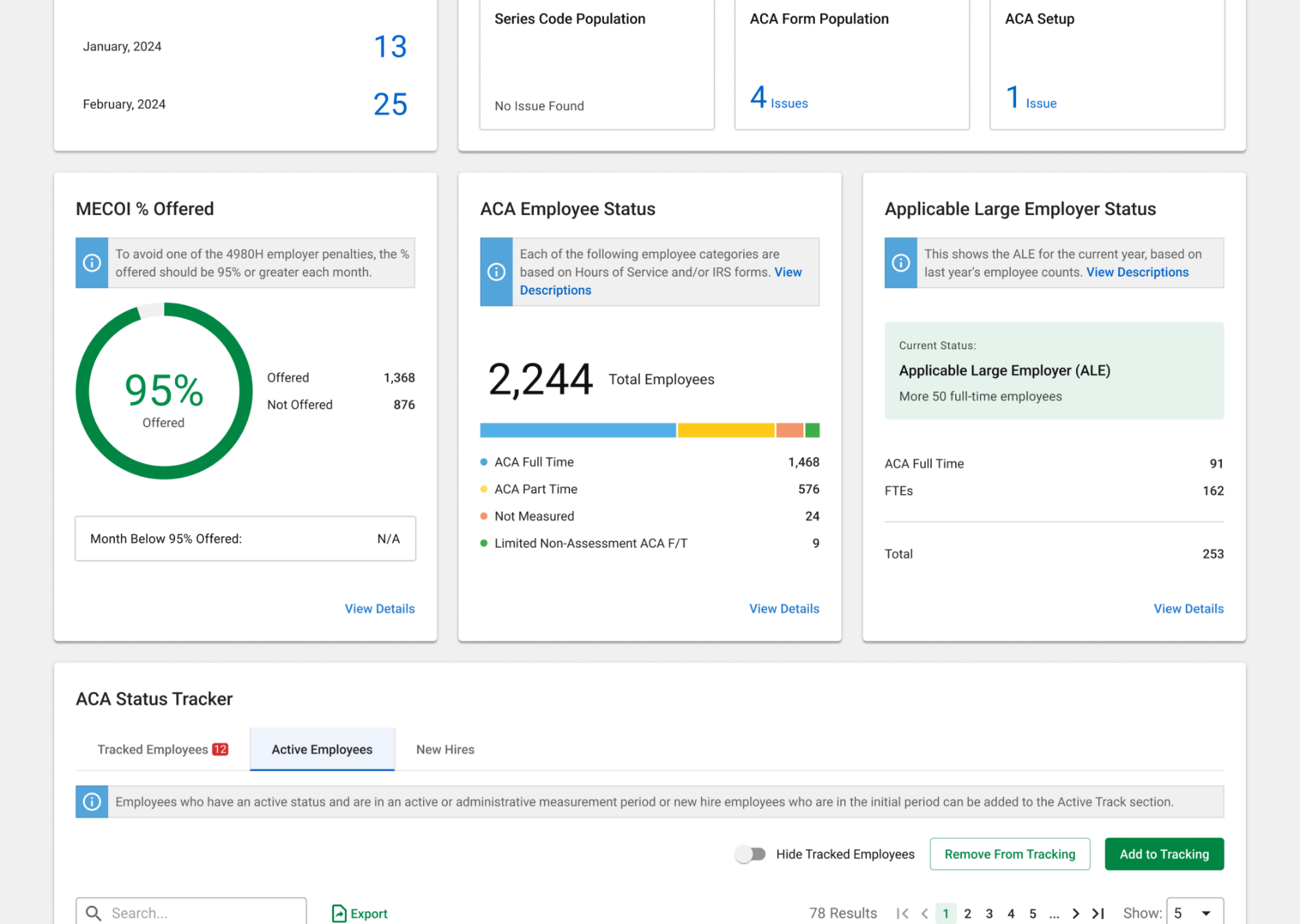
I added an employee tracking feature to help users quickly identify critical employees from a large data pool, streamline status tracking, and prioritize relevant cases for easier ACA monitoring.
Change 3
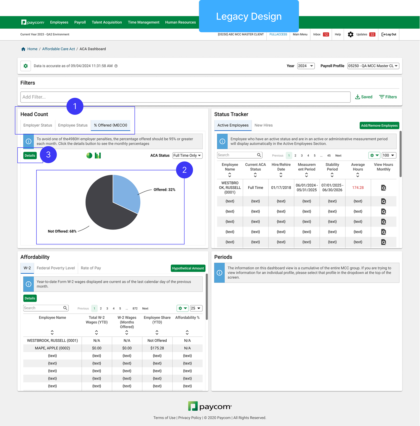
1. Active Hunting Issue (Before)
Legacy design entirely rely on users to interpret data and discover issues themselves.
2. Improved Discoverability
Bring critical information from hidden tabs to increase discoverability
1. Identify Critical Employees
Empower users to call out attention needed items from crowded data pool.
2. Add Tracking Functionality
Make it easy to track status of critical employees by reducing repetitive item search.
3. Prioritize Tracked Employees
Separate irrelevant employees on a separate tab (default) for efficient ACA status change monitoring.
From User-Driven Search to System-Driven Alerts
I shifted from user-driven to system-driven search by surfacing issues directly on the widget. This change improves efficiency by highlighting critical information upfront, reducing the need for manual searching and enabling users to act on insights more quickly.
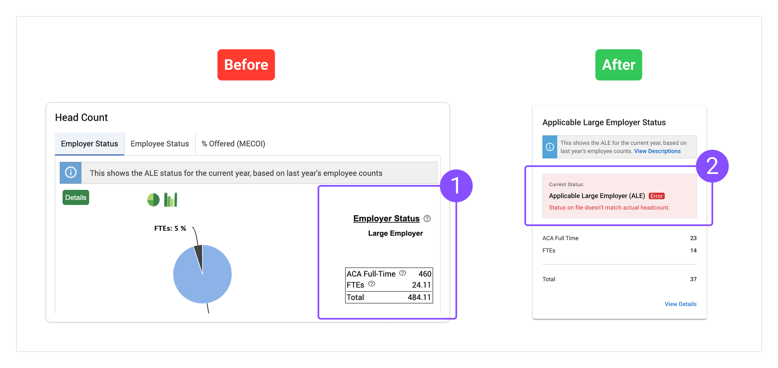
2. Passive Issue Recognition (After)
It is more efficient, reduces cognitive load, and fosters faster decision-making.
Initial Usability Testing
Excessive navigation patterns highlighted ongoing challenges with information overload and efficiency.
While enhanced visuals improved widget usability and task performance, the navigation complexity emphasized the continued challenge of managing information overload and streamlining user workflows.
✅
70% Task Success Rate
Visual optimizations reduce cognitive load and help users quickly interpret key information through more intuitive visual design.
❌
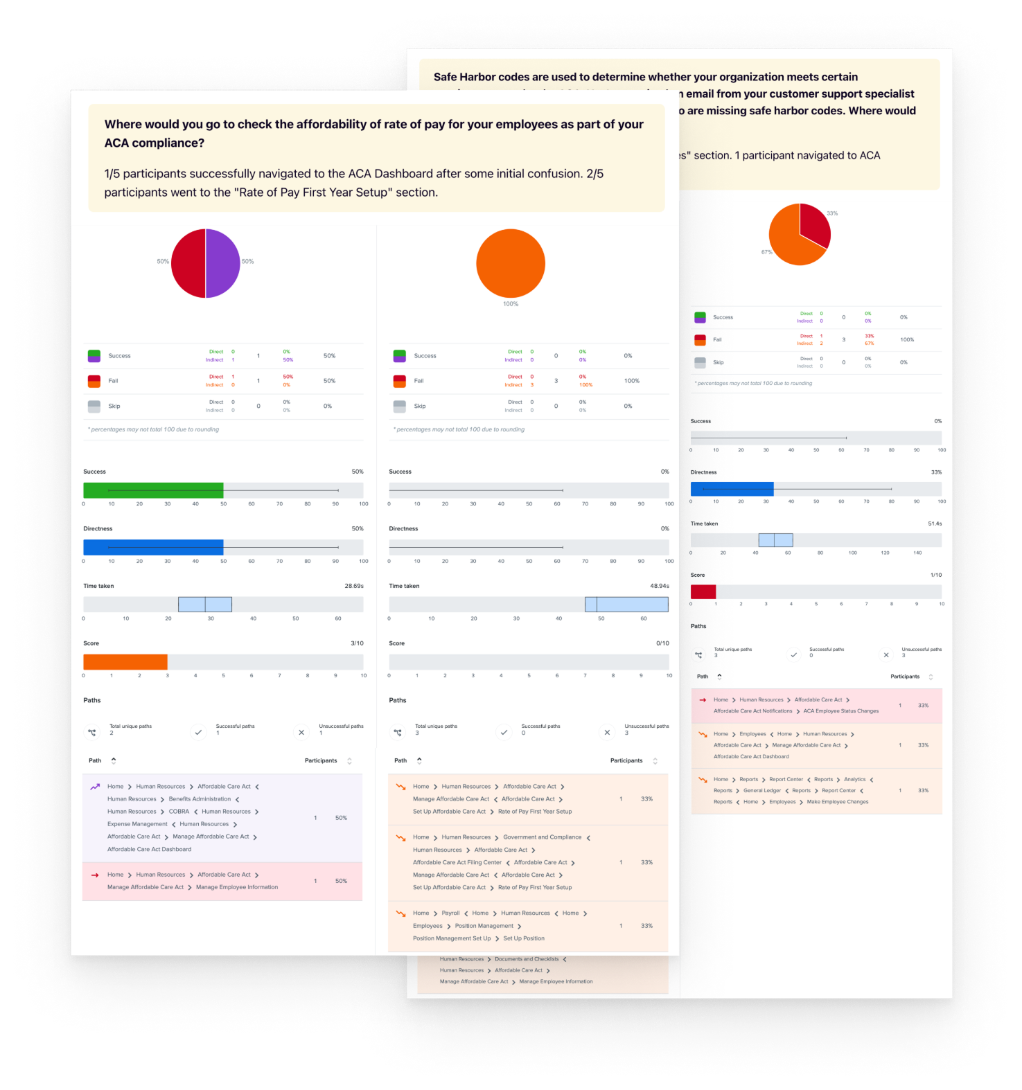
52% First Click Success
Excessive clicks, scrolling, or repeated widget visits in user testing indicate information overload, suggesting that while users eventually find what they need, the content is not immediately accessible or intuitively structured.
Post Testing Deep Dive
The first-click study revealed challenges in quickly locating sub-tasks.
While visual enhancements made widgets more intuitive and improved task success, excessive navigation patterns highlighted difficulty navigating to sub-tasks in the ACA module due to excessive information, slowing their ability to quickly access the right entry points.
New Challenge
HMW refine information hierarchy and layout to improve efficiency and streamline sub-task completion?
Next Iteration
Optimizing information hierarchy
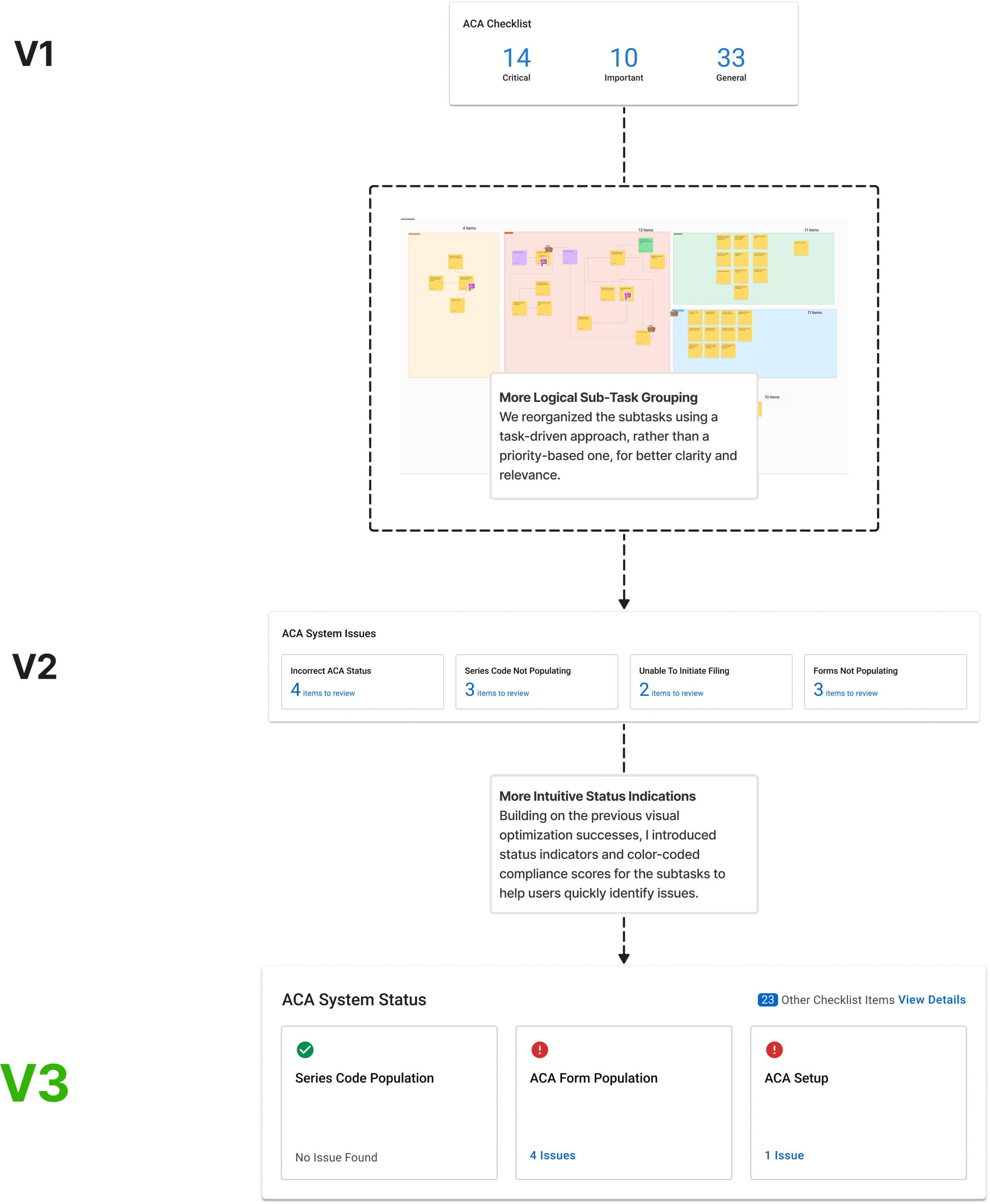
To improve task efficiency without compromising the dashboard’s clarity, I restructured how compliance-related information was displayed by introducing a layered hierarchy.
Segment Tasks by Priority
The PM and I restructured the tasks based on their priority.
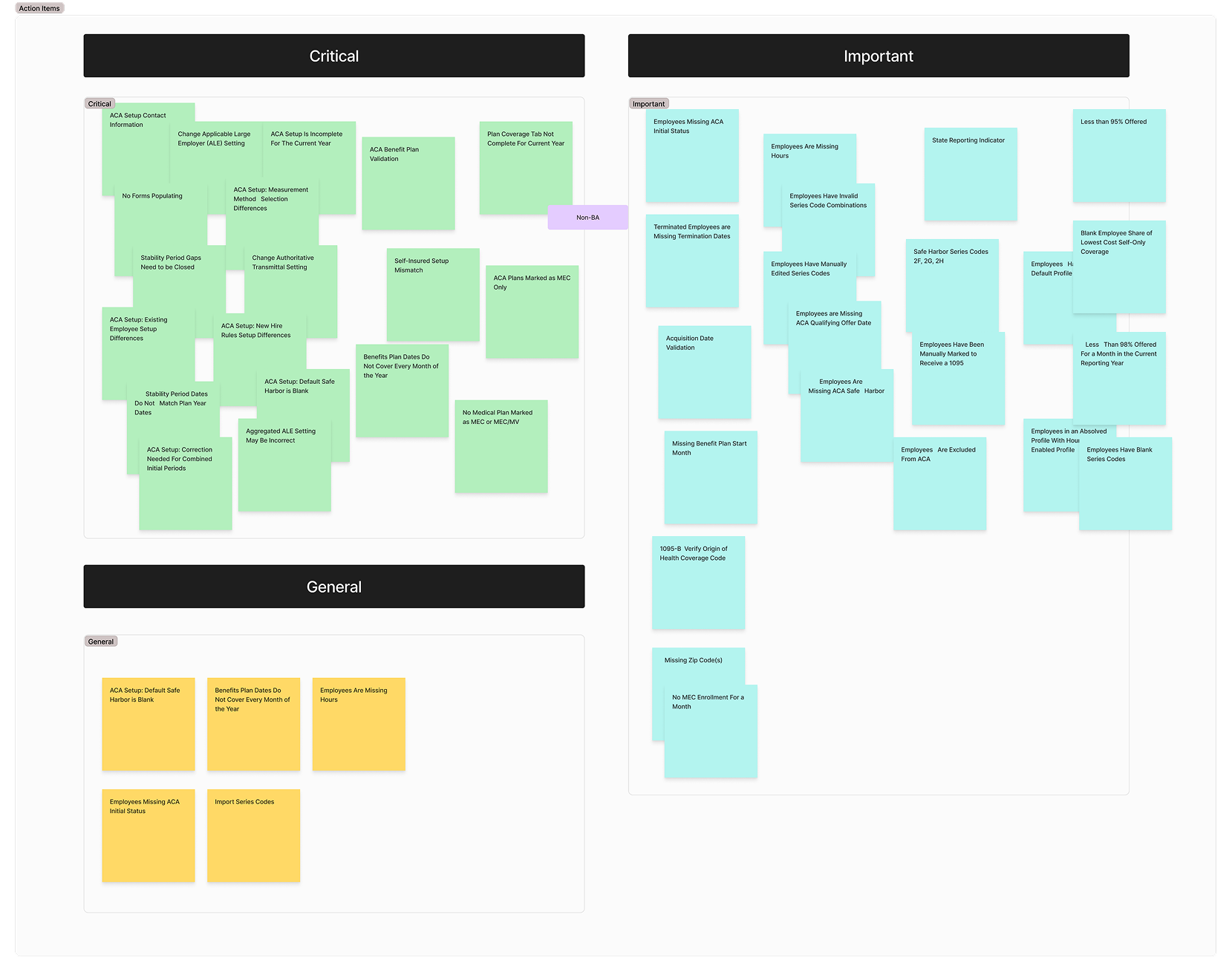
Category 1: Critical
Category 2: Important
Category 3: General
Approach
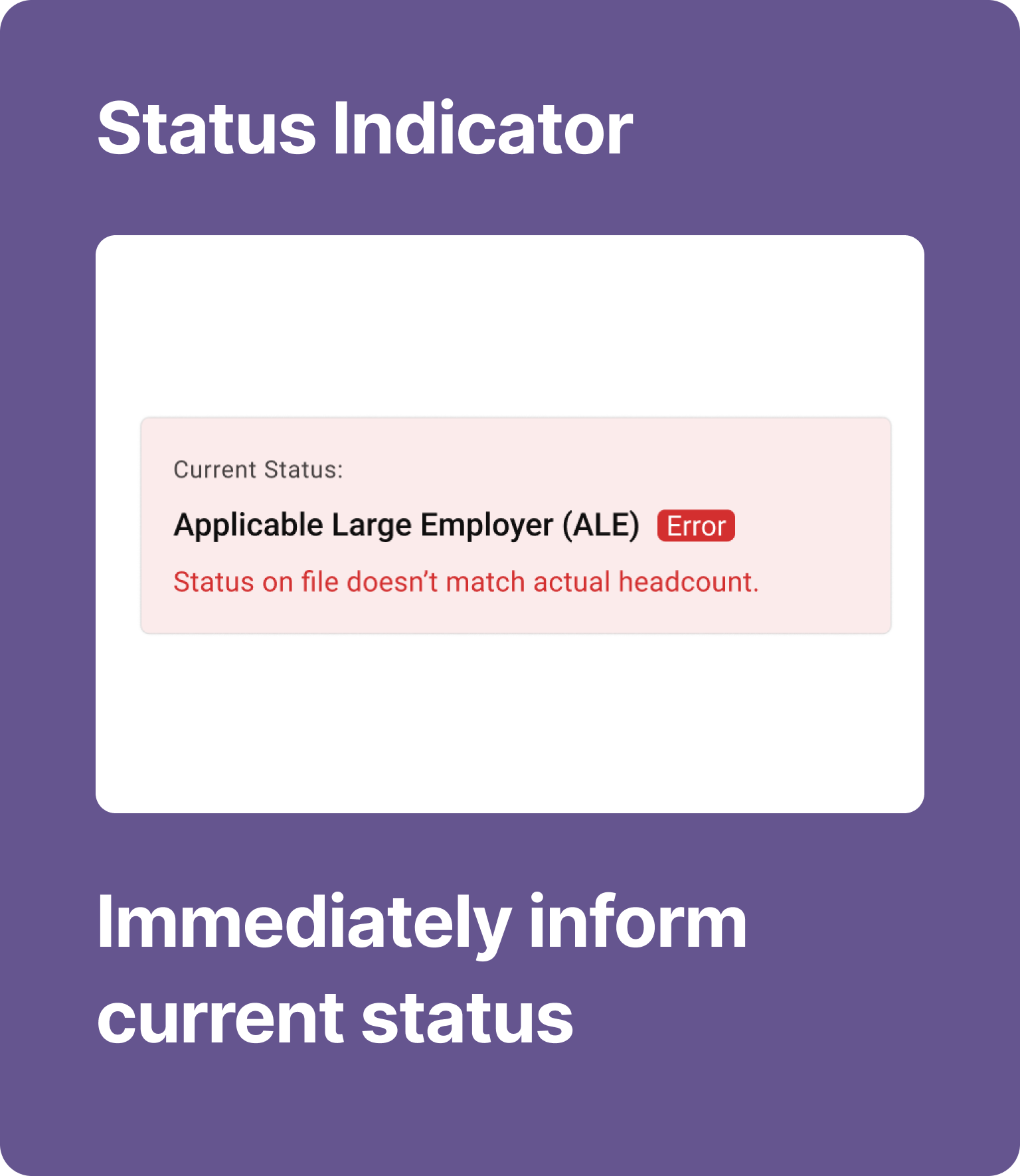
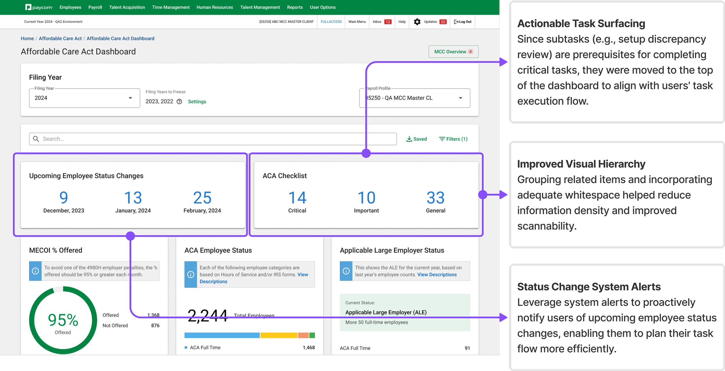
Surfacing sub-tasks to minimize search time.
In this iteration, we introduced two new widgets to provide system status alerts, guiding users through the completion of their subtasks. By restructuring the presentation of subtasks as action items, we aimed to help users quickly identify and act on critical compliance issues, minimizing search time.
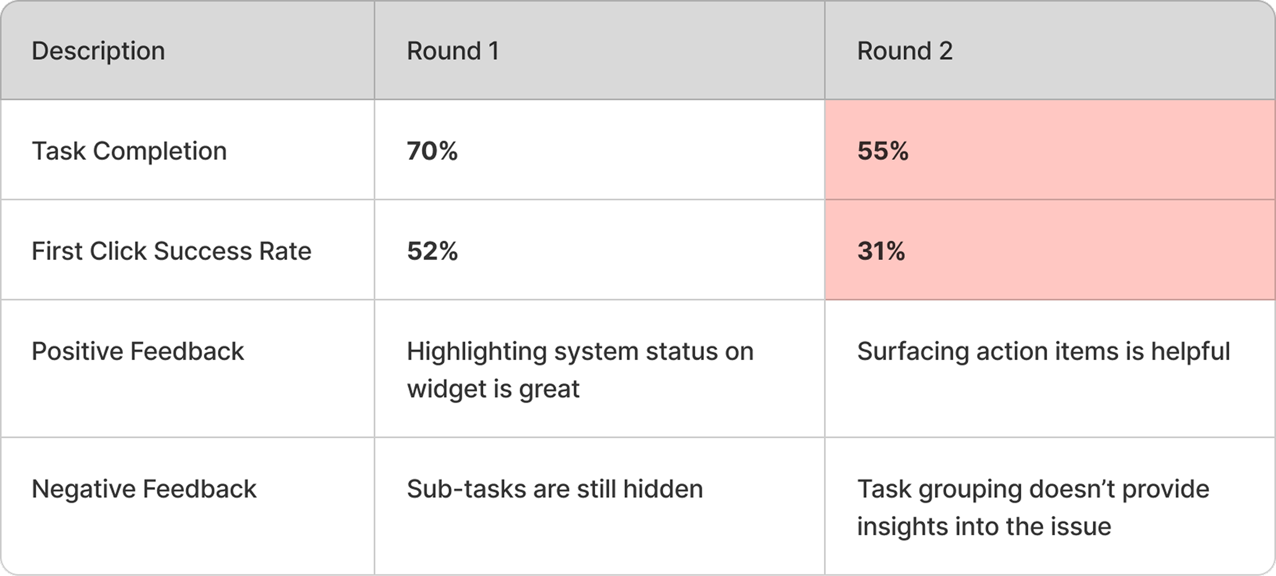
Testing Results
Surfacing more items causing information overload
This iteration revealed that simply surfacing subtasks is not enough—the information needs to be structured in a way that guides users toward problem resolution rather than overwhelming them with number of items.
Further Changes
More direct and efficient information display for sub-tasks
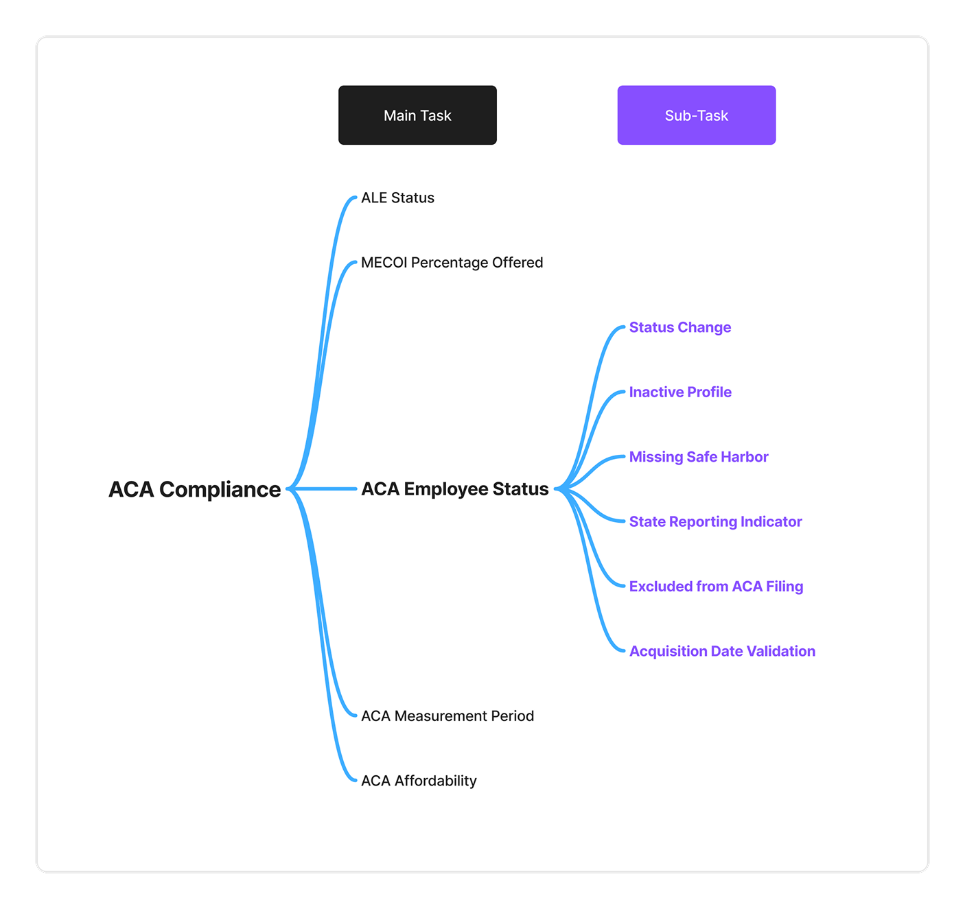
After the previous iteration’s failure, I returned to the core issue: How can we make information display more efficient, helping users quickly locate key details and complete tasks? This time we reorganized the subtasks based on their corresponding root problems, as it aligns better with user’s task execution logic.
Step 1
Re-group tasks based on task relevance, rather than priority.
Step 2
Leverage status indicators to enhance discoverability and guide decision making.
Final Results
Significant increase in task completion comparing to our initial measurement!
User feedback confirmed the new design was more intuitive, allowing them to quickly locate key information and complete tasks efficiently.
76%
65%
Task Success Rate
A 38% increase to our initial measurement.
First Click Success
A 25% increase to our initial measurement.
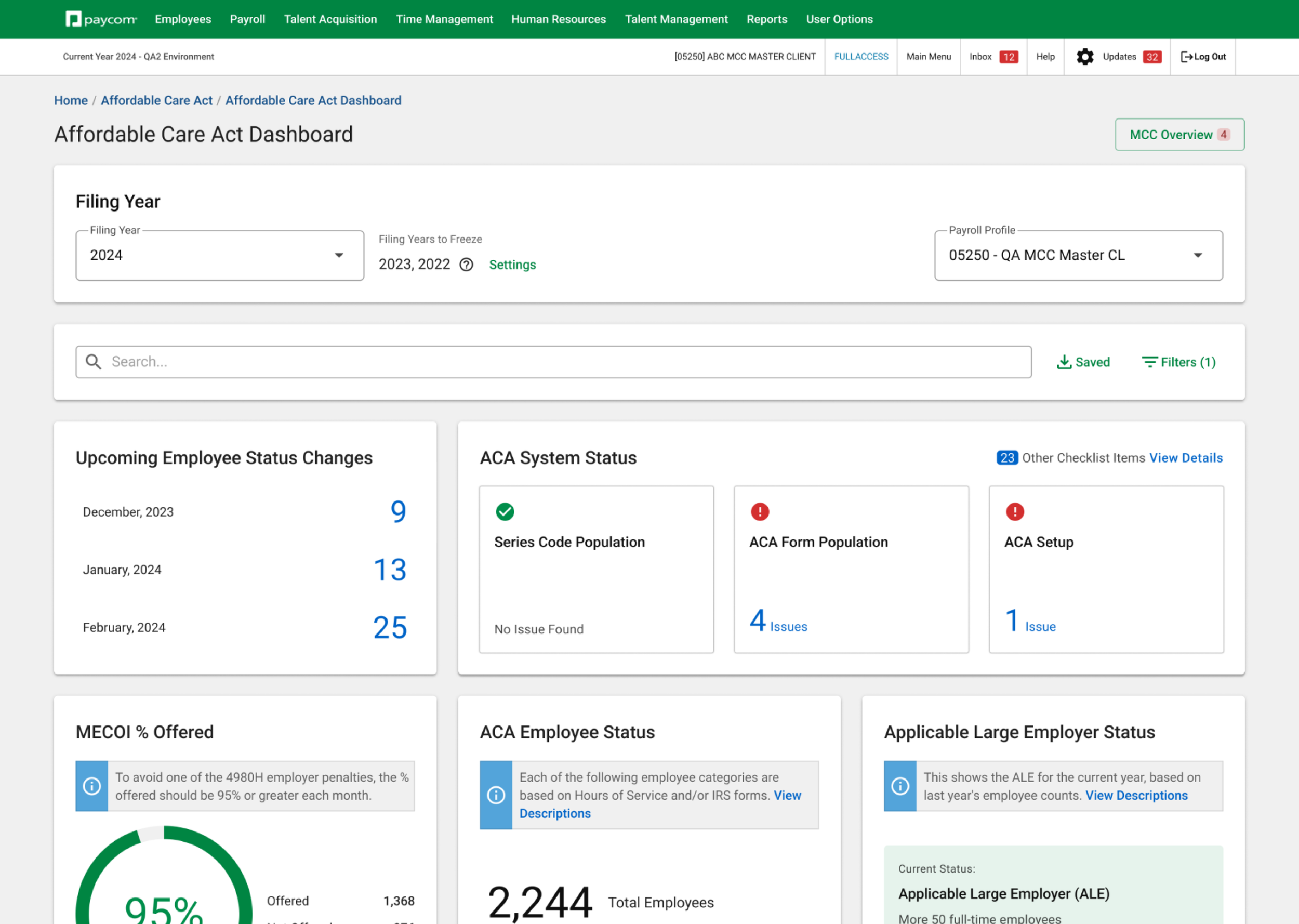
Sub-tasks & upcoming changes
Main ACA compliance status
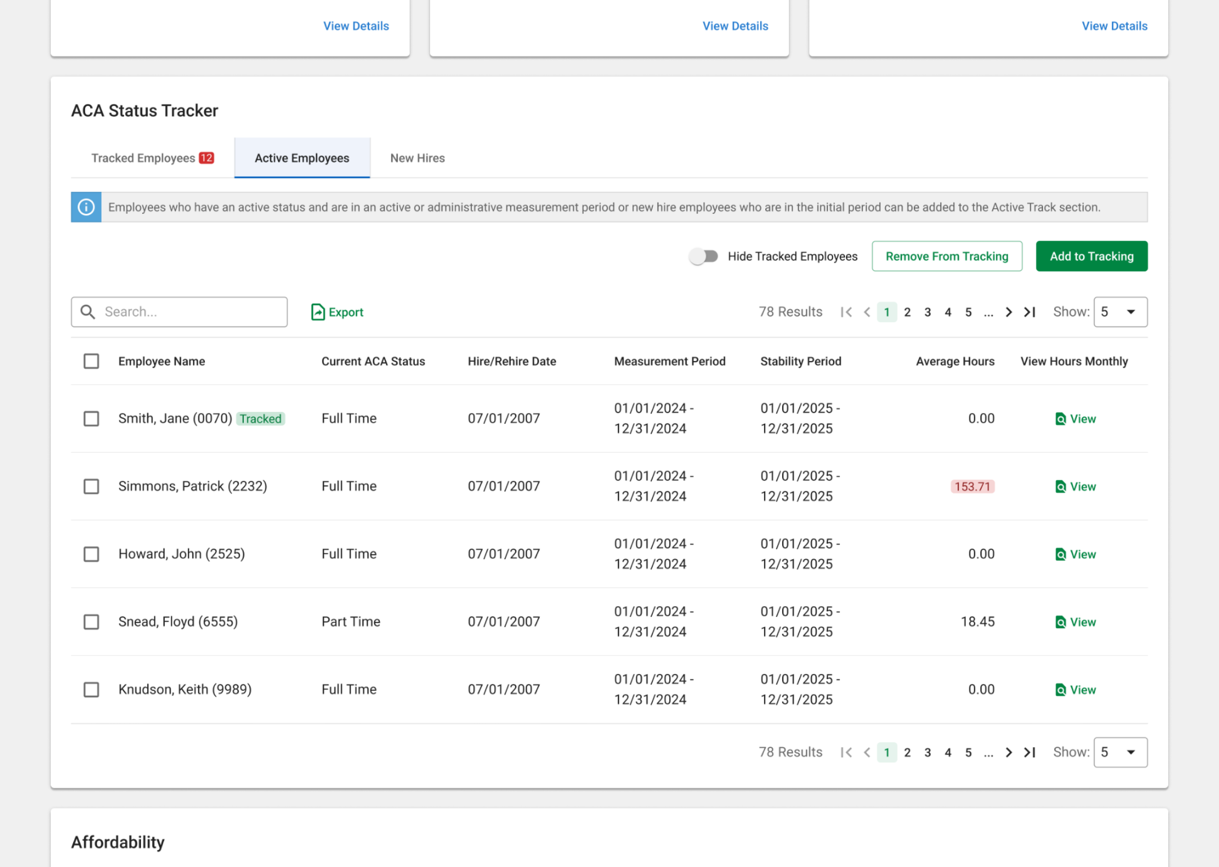
Employee status tracker
Affordability tracker
Takeaways
Evolving my skills in task-oriented design
This project was successfully released in Q4 2024, resulting in a 21% increase in task success rate and a 35% reduction in time on task, which significantly drove platform adoption. This experience deepened my understanding of designing for clarity and efficiency, reinforcing the value of task-oriented structures, progressive disclosure, and data-driven iteration. It has strengthened my ability to balance usability with complexity, ensuring that design decisions truly support user workflows.
Key Learnings
-
Information display and widget design must align with users’ core task goals
-
Progressive disclosure helps users focus on critical content while reducing cognitive load
-
Through user testing and data feedback, we could quickly validate hypotheses and refine the design